Jörg Trommer is a master painter based in Nürnberg, offering a wide range of services that extend beyond painting to include floor treatment, renovation, and interior design. This logo system was developed while working as an independent Art Director, contracted by the agency Gestaltung unserer Tage, which commissioned the project. Through research into Trommer’s background, experience, and hands-on approach, we defined a brand strategy centered on portraying him as a Handwerker — skilled, grounded, and deeply connected to his craft.
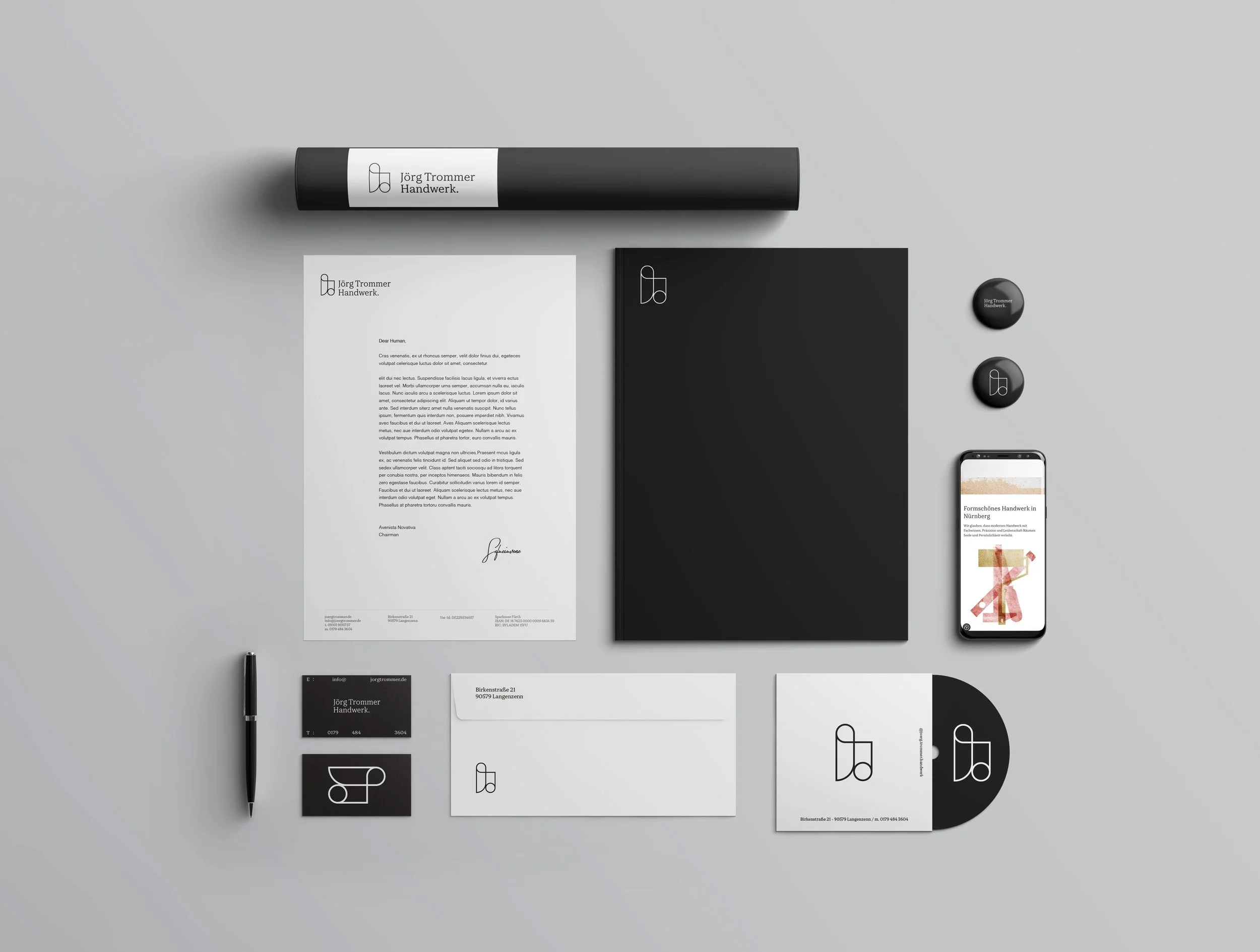
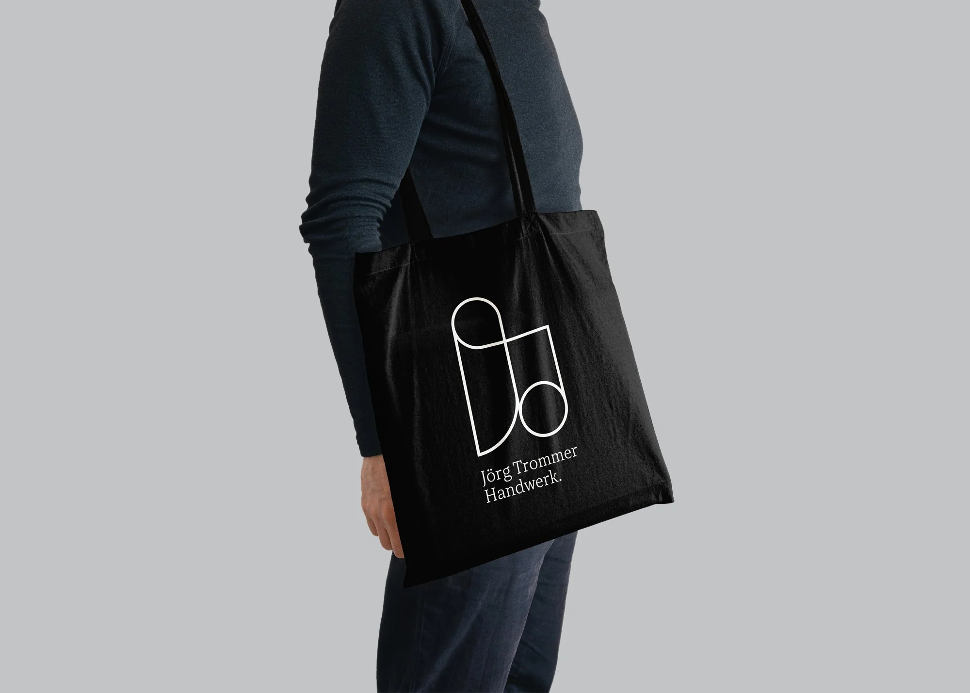
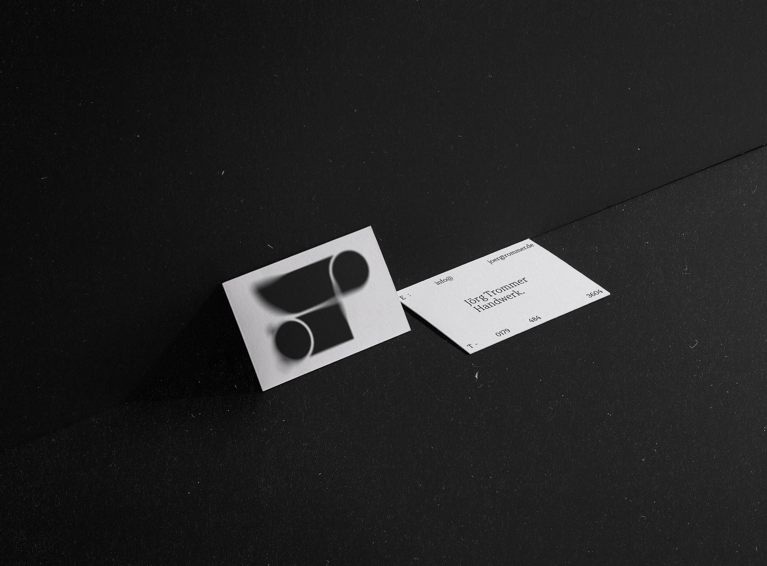
This is why, inspired by the old monograms artisans once used to sign their work, I designed a monogram-style logo with a contemporary and minimalist appeal. The result is more than just a brand—it is a symbol of the prestige and quality that Jörg Trommer’s work represents.
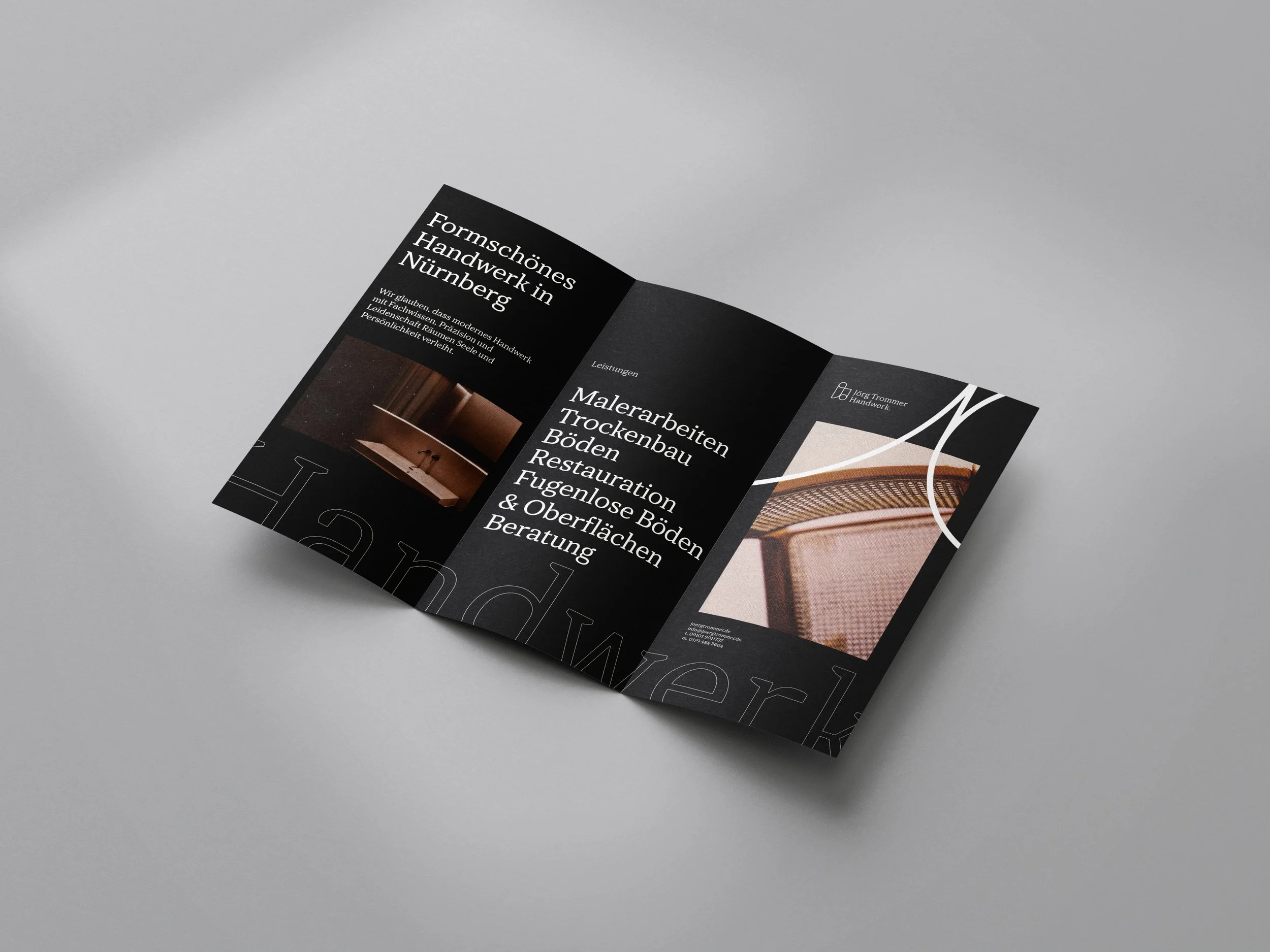
In order to create a brand constellation across different formats, I took inspiration from the graphic elements found throughout Jörg’s workshop and used them as core communication components. These included textures, grain, wallpapers, paint stains, rust, leftovers, and tools. This approach allowed me to create backgrounds that support and enhance the graphic elements.


In oder to be consistent with the concept, I designed a website in a more handcrafted way—mixing textures, paints, tools, and those intentional imperfections that not only showcase his work but also tell his story.
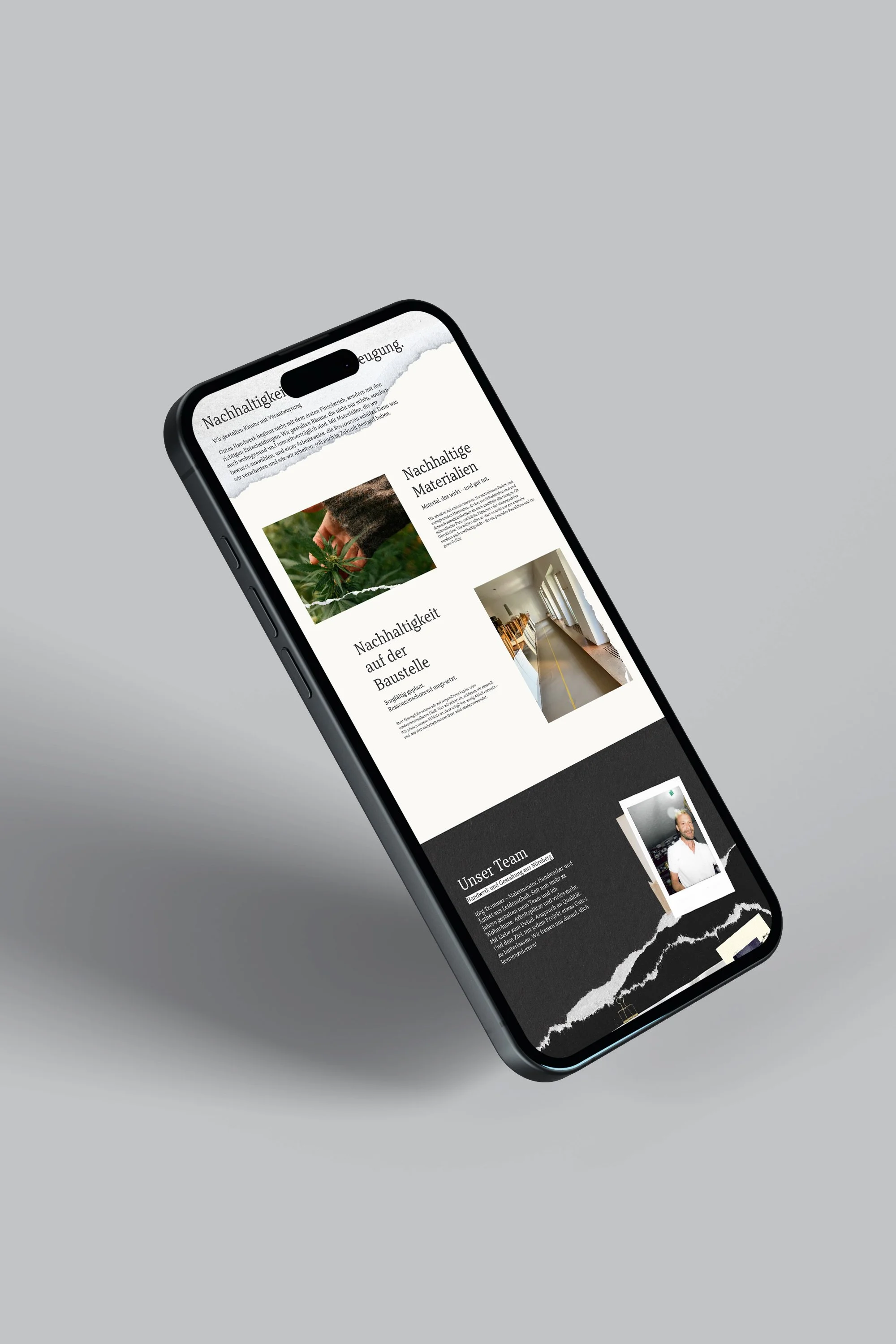
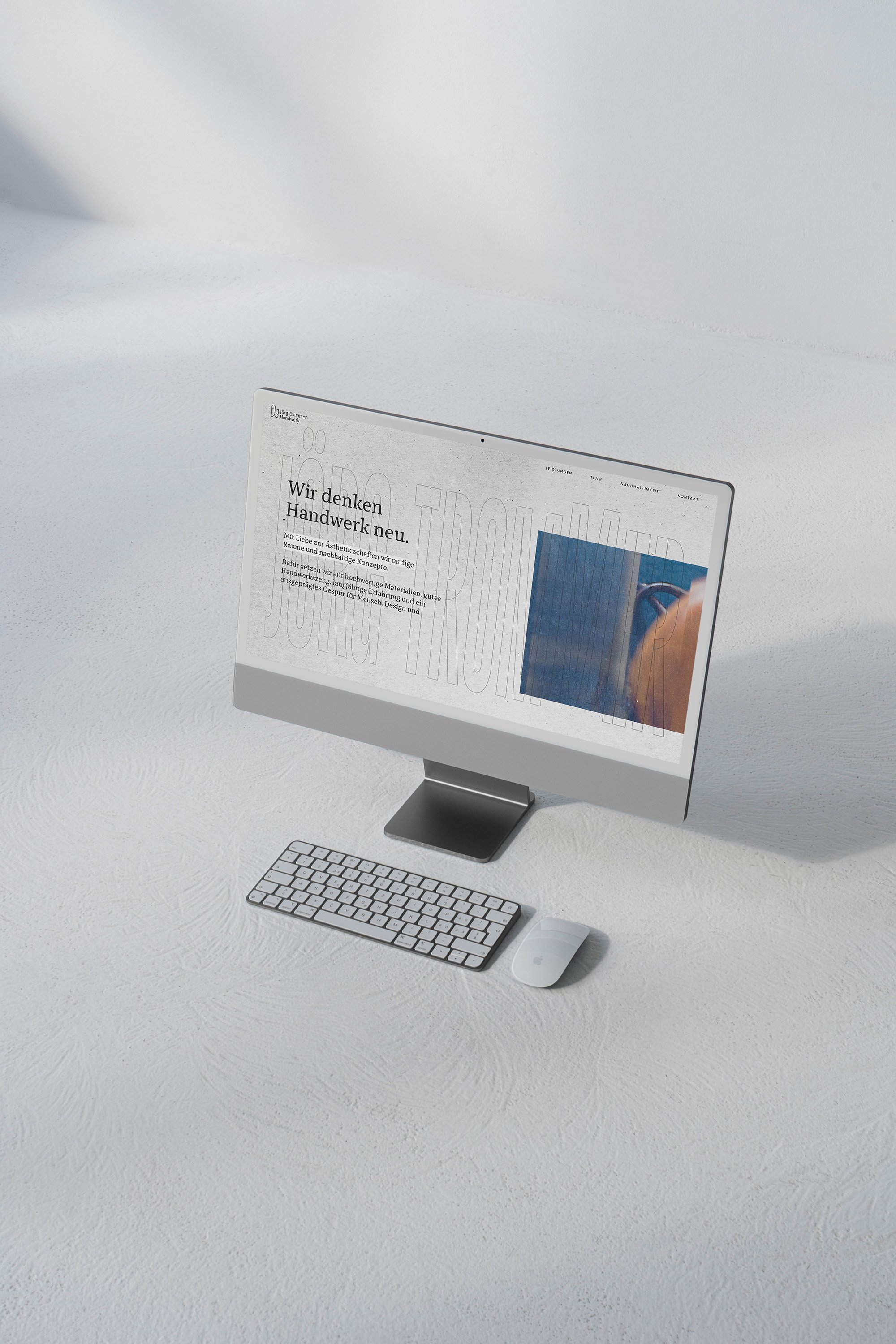
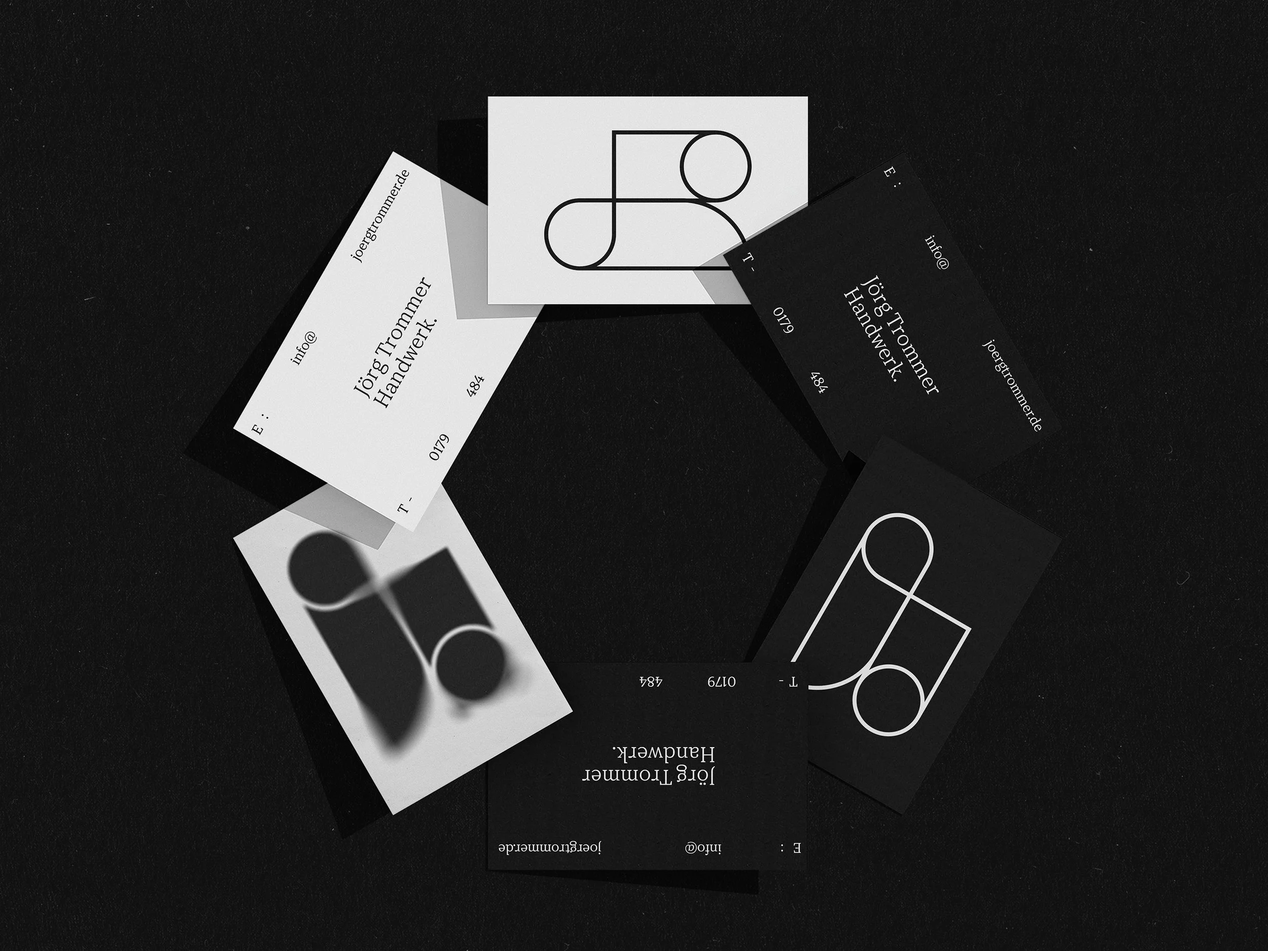
Sustainability is part of Jörg’s work methodology; therefore, we are aware of the amount of material that ends up as waste during any remodeling or renovation project. For this reason, we integrated the concept of re-use leftover materials into communication supports, primarily using them as mixed-format graphic elements. This approach can be applied to stationery—such as business cards, posters, or other formats—transforming them into the DNA of Jörg Trommer’s brand identity.
If you want to know more about the project, check out the details at the following link to my blog: